Introduction
Welcome to the SmartDataSoft brand guidelines. The SmartDataSoft is more than just a badge or logo. A unified and consistent use of these guidelines is one of the key ways by which we will visibly distinguish and convey the core message of what SmartDataSoft is and what we stand
for in this technology world. These guidelines are designed to help everybody involved our partners, team members, clients and our customers too as they also play an important role in building our brand. Please take time to read and understand them: The relationship between each element of our visual identity has been carefully considered and developed to ensure that our visual identity must remain consistent all around the world.
This document provides detailed guidelines for working with SmartDataSoft visual identity. It includes an overview of our brand identity, brand visuals, brand strategy, brand voice and brand execution.
Thank you for making the brand a priority!
Table of Contents
1. Brand Identity
1.1 WhoWeAre
1.2 Mission, vision, Strength & Values
1.3 Our Audiences
2. Brand Visuals
2.1 The SmartDataSoft Logo (LogoType, WordMark)
2.2 Logo Placement (Clearspace & Sizing)
2.3 Logo Usage (Application Areas, Logo Don’t)
2.4 TypoGraphy (TypeFace Family)
2.5 Colors (Our Colors Palettes)
3. Brand Visuals
3.1 Brand Touchpoint
3.2 Brand Architecture
3.3 Brand Promise
3.4 Brand Personality
4. Brand Voice
4.1 Expressing Our Message
4.2 Our Name
4.3 Our Tagline
5. Brand Execution
WhoWeAre
About Us:
We are a company developing premium themes and plugins for end customers on Envato Marketplace. Our Brand Identity is our Customer Support through client management experience. This is how we’re going through on. That’s it! About Business Information & Brand Story
Founded in 2008 by Md. Arifur Rahman here from Dhaka, Bangladesh from the passions of coding. For nearly within some few years, we have just reached at Level 11 at Envato Marketplace with providing awesome customer supports by loving our customers with customer experience management. Our developed themes and plugins randomly get featured as top selling items on Envato. This is how we’re growing through as a brand.
Passion:
We love to work with WordPress, PrestaShop, Shopify and other CMS too! And love to develop awesome Themes and Plugins based on those CMS web software that gives unlimited possibilities. We’ve always thought about Customers problem-solving in mind as a challenge
that we always love – from customers problem-solving at the office through to programming in our mind.
Mission:
Because We believe each and every human needs their own website. That’s why we’re working hard day and night!
Strength: We are very much pleased by getting tons of LOVEs, appreciations, suggestions, thumbs up from our valued clients, customers and even our partners too! “Quality comes first”, based on this expression SmartDataSoft is determined to give awesome customer supports smartly.
Here’s why people loving us…
Values:
Things We Love: Customers, Team Members, Partners, WordPress, PrestaShop, Shopify
Things We Don’t Love : Dishonesty, Indiscipline and, anything which is HARAM![/vc_column_text][vc_separator el_id=”our_audience” css=”.vc_custom_1531823307767{margin-top: 20px !important;margin-bottom: 20px !important;}”][vc_column_text]
Our Audience
We love to design & develop awesome themes and plugins for the end users on Envato Marketplace. Users purchase their desired themes, plugins and other digital goods as per their needs from content creators like us. We’ve developed a huge no of top selling themes and plugins on Envato Markets for Prestashop, WordPress, Shopify, and OpenCart platform. This is how we’ve built a tremendous customer support for the end users. So, we highly value our beloved customers, who treat and share their business needs with us like they’re part of SmartDataSoft family. We understand them, their needs and their customers too!
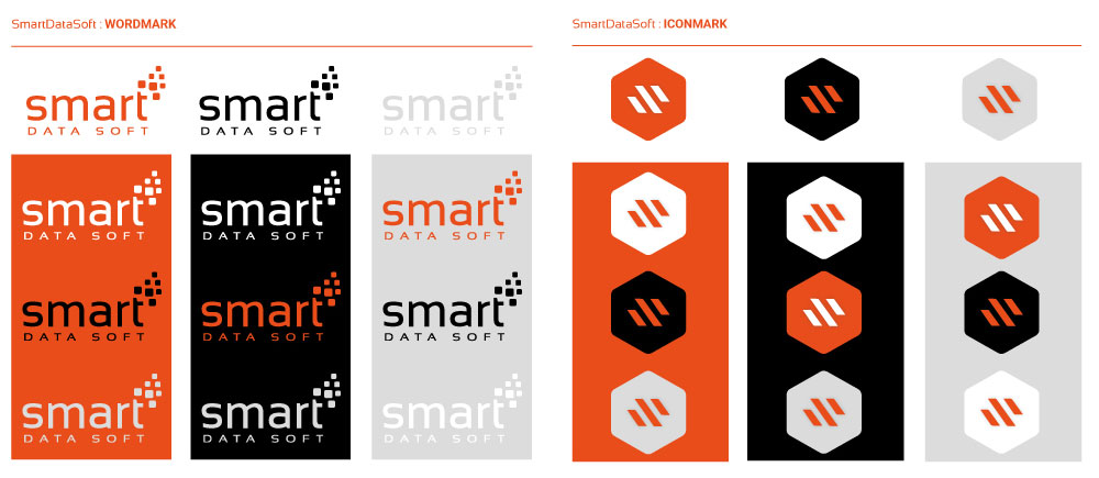
The SmartDataSoft Logo
As a logo is one the main aspect of a company’s commercial brand or economic entity, and its shapes, colors, fonts, and images usually are strikingly different from other logos in the same market niche. In keeping with our brand personality, our logo is simply straightforward and
simple. As a Hexagon shape is an example of a geometric body with 6 sides, means we have an ability and believe in developing themes and plugins using our ‘Sixth Sense of Revolution’ including other five sense of sight, hearing, smell, taste, and touch. This is how our icon shape
makes us crazy! The SmartDataSoft logo includes STAND-ALONE and TAGLINE variations are a clear signpost for our brand and our primary visual symbol.
Stand-Alone Logo

SmartDataSoft
WordMark & IconMark
The SmartDataSoft Wordmark is the most common expression of the SmartDataSoft Visual Identity. It combines the clearest communication of the brand name with the most flexible rules of application. It should be used consistently to raise brand awareness. Our Wordmark may ONLY
be used in the color combinations shown here. It may NOT be placed on a HIGHLY-PATTERNED background or photograph. Our IconMark shape is the most using identity through web and social media networks. This is an example of a geometric body with 6 sides, which means we have an ability and believe in developing themes and plugins using our sixth sense of revolution including other five sense of sight, hearing, smell, taste, and touch.
There are four logos (WordMark & IconMark) variations that cover all possible applications.
01. Primary Logo (ORANGE): The logo is available in all basic formats for digital (standalone)
and print (tagline) use. The primary full color logo should be used whenever possible.
02. Secondary Logo (WHITE): Logo to be placed on colored backgrounds, images etc.
03. Black Logo: Logo to be placed on colored backgrounds, images etc.
04. Gray Logo: The gray logo should be used when full color printing is not an option.
We’ve selected GainsBoro from gray color.
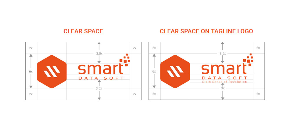
Logo Placement
The SmartDataSoft logo and SmartDataSoft Mark should always be surrounded by a minimum area of space. The minimum clear space is defined as X. Measured by the sixth (6th) of the height of the Hexagon (icon). The minimum clear space of 2x around the “Hexagon” and 3.5x above and below the letters should always be applied. Try to maximize clear space whenever possible. Always scale the logo proportionally.
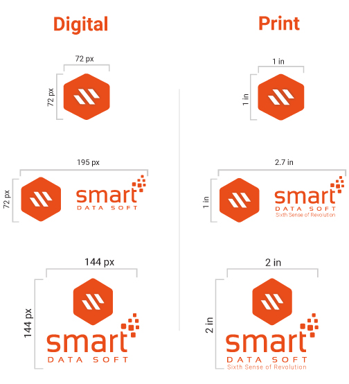
Sizing (Minimum Size)
The minimum logo size provides the smallest possible reduction in which the logo is still easy to read. In exceptional circumstances, smaller sizes for print may be necessary. In such cases, readability should always be your top priority.
Logo Stand-Alone:
For Digital Media : 195px X 72px
For Print Media : 2.7 in X 1 in
Logo With Tagline:
For Digital Media : 144px X 144px
For Print Media : 2 in X 2 in
ICON:
For Digital : 72px X 72px
For Print : 1in X 1 in
Minimum Size
Logo Application Areas
Our logo has multiple scopes to use in a specific application. We have two variations of our logo- Stand-Alone logo and tagline logo. When using the stand-alone logo please consider the Horizontal Orientation and whenever using tagline logo please consider Vertical Orientation shape.
Stand-Alone Logo Used:
• SocialMedia
• SmartDataSoft.Com pages
• Products, packaging
• Data Sheets, White Papers
• Internal Emails
• Presentations
• Events Collateral
• Co-Branded Materials / Sponsorships
Tagline Logo Used:
• Advertising (Print, Outdoors, TV)
• Catalog Covers
• Videos
• Stationary
• Printing Materials
• Brand Materials like Pen, PenDriv
Tagline Logo Recommended but Not Required:
• Email Marketing
• Online Advertising
• Brochures, Posters (Internal & External)
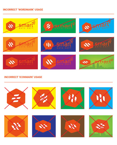
Logo Don’t
Our Logo is our most valuable asset, as like as the face that you have! We must treat it nicely. So, don’t punch in our logo (face), it doesn’t have arms, that’s why it can’t fight back! The SmartDataSoft logo should always be used in its approved format. It should never be modified. Altering the logo weakens the integrity and consistency of the brand. Here are examples of what not to do with the logo. Now that we understand the essence of the SmartDataSoft brand, we must also understand the specifics that build the base for it.
Typography
Typography is a strong extension of our brand personality. The selection and use of our corporate typeface have two functions. Firstly, to create a distinctive and consistent look across all our communications. Secondly, to help the reader navigate a blog, document, delivering messages with impact and clarity.
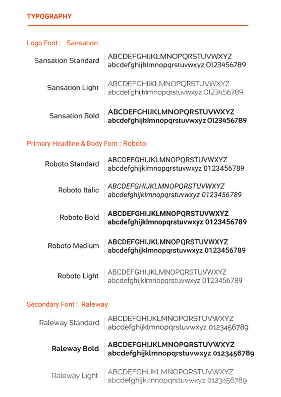
TypeFace Family
We use Sensation (WordMark) and Roboto (Tagline) as our logo font family. Sensation is our voice. The ‘Sensation’ and ‘Roboto’ is the core of our visual identity and synonymous with our brand. We should also use ‘Raleway’ as Secondary font for Social Media channels. It should be used in all materials to maintain consistency in our messaging and branding. This modern and approachable typeface helps us to communicate with our customers easily and smartly.
Primary Font We Use : Roboto 700 is to be used as primary font.
Logo Font : Sensation
Body Font : Roboto
Menu Font : Roboto
Headings Font : Roboto
Secondary Font We Use : Raleway for SocialMedia Channels.
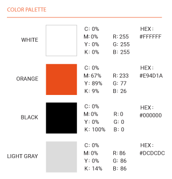
Colors
Color is a great identifier:
Cricket teams, Electronics and even non-structured companies “own” colors that are instantly recognizable and represent who they are. By understanding and exploiting this principle we can use color to influence the way people think about us and build strong associations with our brand and our products too. Proper application of the primary corporate color palette helps to ensure a consistent and credible communication of the company.
Our Colors Palettes
Our corporate color palette consists of ORANGE (e94d1a), gray (We’ve selected GainsBoro from gray color), white and black. When it is not possible to print a solid Pantone color, check our recommended CMYK breakdown. Always use the percentage breakdowns specified here to
achieve the closest match to Pantone colors. RGB and web safe values specify colors for screen and Internet display. These guidelines are designed to be viewed on screen. RGB color printouts should not be used to match the color. Always use the relevant matching system to ensure consistency. These colors or their equivalents should set the tone of any application which stages the company or is a communication from the company.
Overall, brand colors should be used in the following percentages (image below).
Our Brand Strategy
Good brands should be more than the sum of the services they provide. In our case, we realize that we serve our customers on diverse level, and this diversity must be reflected in our brand.
01. BRAND TOUCHPOINT :
Themes, Plugins, Envato Marketplace, ThemeForest, CodeCanyon, PrestaShop,
WordPress, OpenCart, Joomla, Visual composer, Slider Revolution.
02. BRAND ARCHITECTURE :
Primary logo, Secondary Logo etc.
03. BRAND PROMISE:
At SmartDataSoft we offer our customers by designing and developing awesome themes
& plugins backed by industry leaders. We deliver this through our commitment to
creativity and quality with standards and an emphasis on strong family values. We
promise to design and develop our works from the sixth sense of revolution, that people
love.
i. Brand Offering:
Theme & Plugin Development, Quality, and with Optimal Customer supports.
ii. Brand Essence:
Quality Codes, Trending Designs and Customer Supports.
iii. Brand Promise:
We work using Sixth Sense of our life.
04. BRAND PERSONALITY:
Our Brand personality defines our icon with customer support voice. The brand is
described in human terms because ‘SmartDataSoft’ needs to resonate with the people
delivering the brand, as well as those are experiencing on it. This is why all of our team
members are our brand personality as they’re supporting our loyal customers smartly
through day and night!
Overall, brand colors should be used in the following percentages (image below).
Our Brand Voice
Communication is a very important aspect of any brand. The way we communicate sets the tone for how our audience feels about us. Not only will partners have a clear idea of what SmartDataSoft stands for, but they will also be able to easily connect to our brand.
01. EXPRESSING OUR MESSAGE:
Our voice consists of both messaging and tone. These two communication aspects come together to create an effective strategy when speaking to our customers and fans. We have a goal to create clear and consistent messaging that reflects our brand personality. What is our voice?
Our voice is what makes our personality stand out. The tone that we use to express our
message should be:
Passionate – Expressive, Enthusiastic, , Action-oriented
Supportive – Heartfelt, Helpful, Listeners
Authentic – Genuine, Trustworthy, Engaging
02. OUR NAME:
‘SmartDataSoft’
The word ‘SmartDataSoft’ has come from the main word ‘SYSTEM’ (noun) and its
adjective is “SYSTEMATIC” which means something like software system, smart coding etc. The
name ‘SmartDataSoft’ is easily rememberable and geeky. Generated from its creator
Md. Arifur Rahman, when he was on working mood as hard rock coder. Which now an integral
part of our brand.
03. OUR TAGLINE
‘Sixth Sense of Revolution’
A clear tagline is important to complement an easily recognizable brand. By showcasing exactly what we sell, our partners have no doubt about our offerings. It is also easy to make the connection with our content creation passion that people loves to spread.
Let’s Make Our Brand LIVE!
Establishing a strong and consistent first impression is very important in reflecting a cohesive
brand. So, it’s time to turn your knowledge with us into action.
Work together?
Let’s Join us as Customers, Team Members, Partners or Happy Visitors!
Get In Touch
https://smartdatasoft.com/contact